The Photographer's Travel Camera

Originally published at PetaPixel

You press the button and we do the rest.
— George Eastman, founder of Kodak

Ever taken professional camera equipment on vacation and left with too many memories of setting up tripods or staring at screens? Well, I have. I've also traveled and taken no pictures at all - only to regret that as well. 

In searching for the perfect travel camera I considered two competing variables: burden vs. quality. For years I carried a Fuji GW690, a medium format rangefinder shooting 120mm film. And with a 6x9 frame the results were very high resolution, in fact it was overkill. (Proof: a 431mb film scan.) It is also a comically large camera(compared against a Leica M6,) way too big to comfortably carry around when traveling. 

I've tried some of today's popular mirrorless options (ex. Sony's A7s or the Fujifilm X‑Pro2) and found I loved the build quality and many of the features. But the endless menus and instant "development" with digital cameras make it easy to over scrutinize images while you're shooting. For me that defeats the goal of spending minimal time taking pictures. And it seems others might agree, just look at this $6k digital Leica with no screen. Yep, a digital camera with no screen. Maybe a radical step in the right direction and definitely something I'd like to own BUT the quality of a digital sensor just isn't what I'm looking for. (Insert film vs digital debate)

Forget all the trappings of modern cameras and just take pictures.
— WIRED Magazine, re: digital Leica w/out a screen

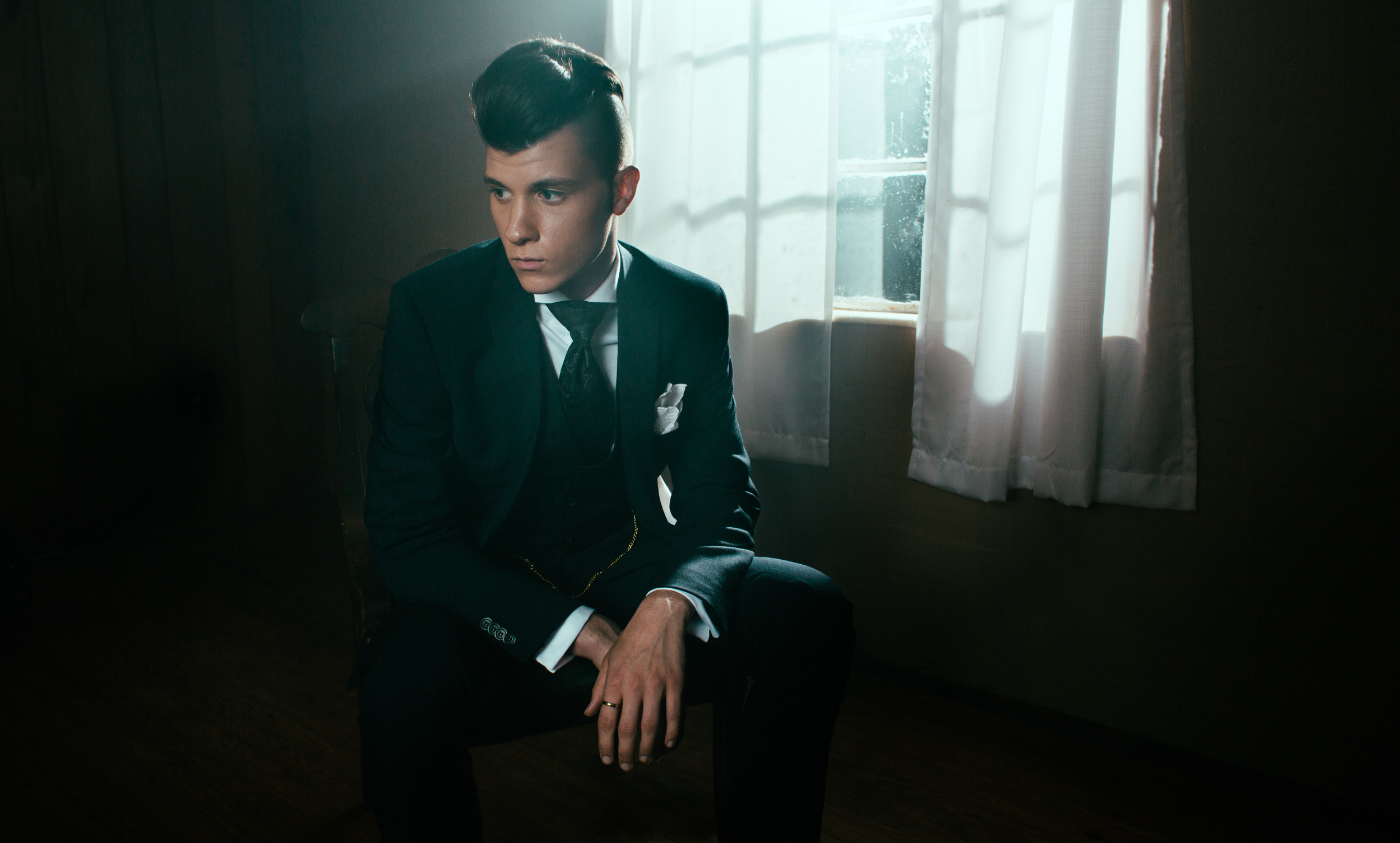
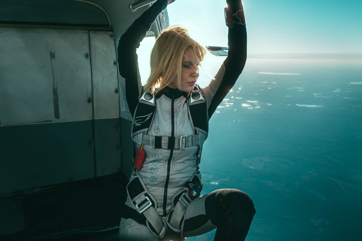
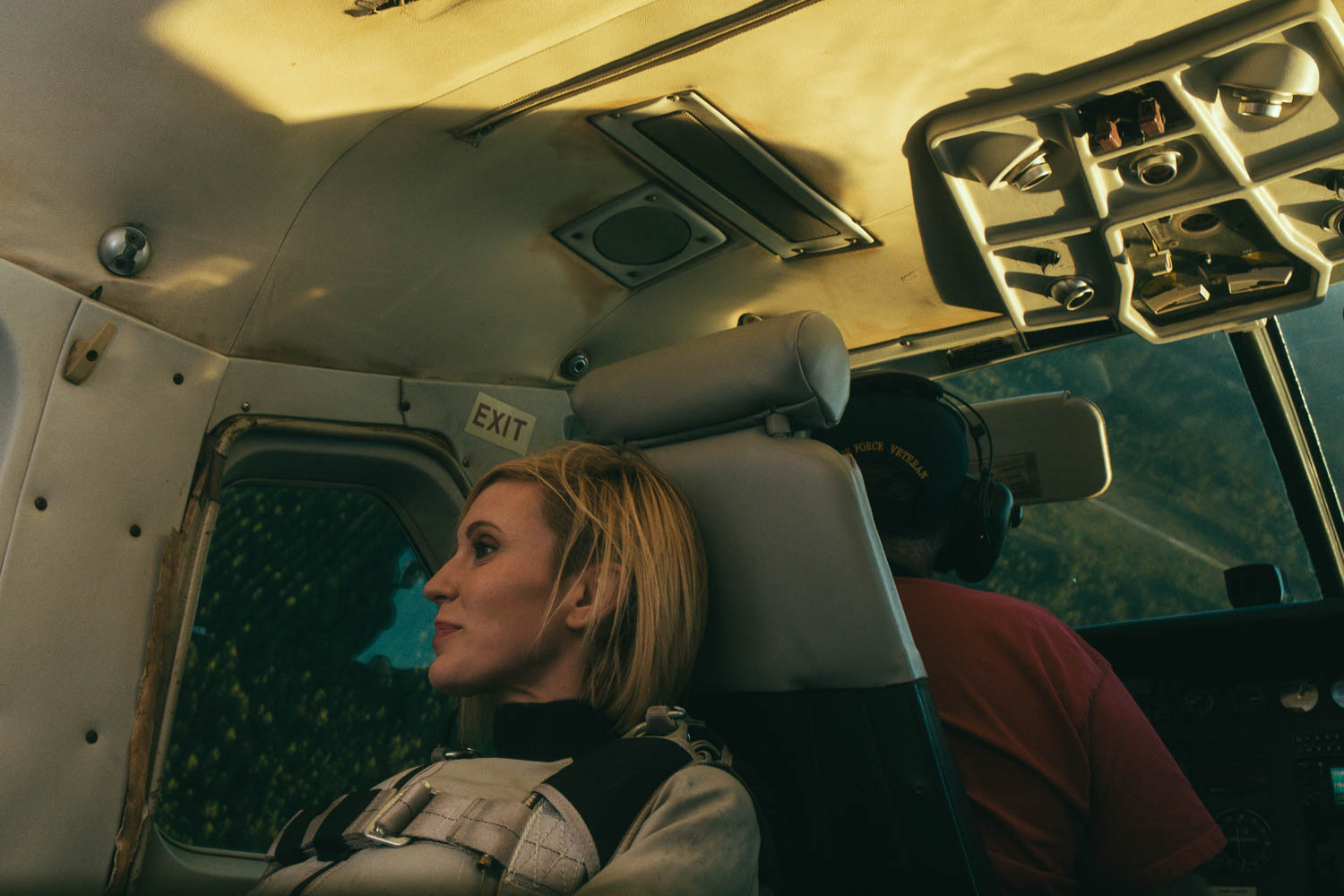
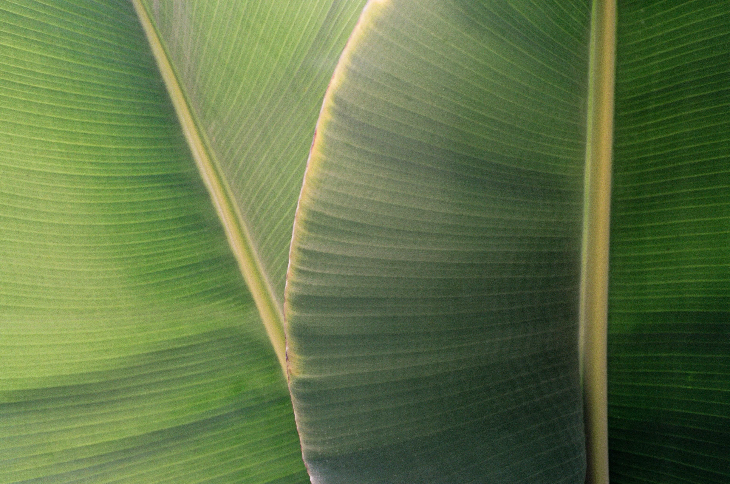
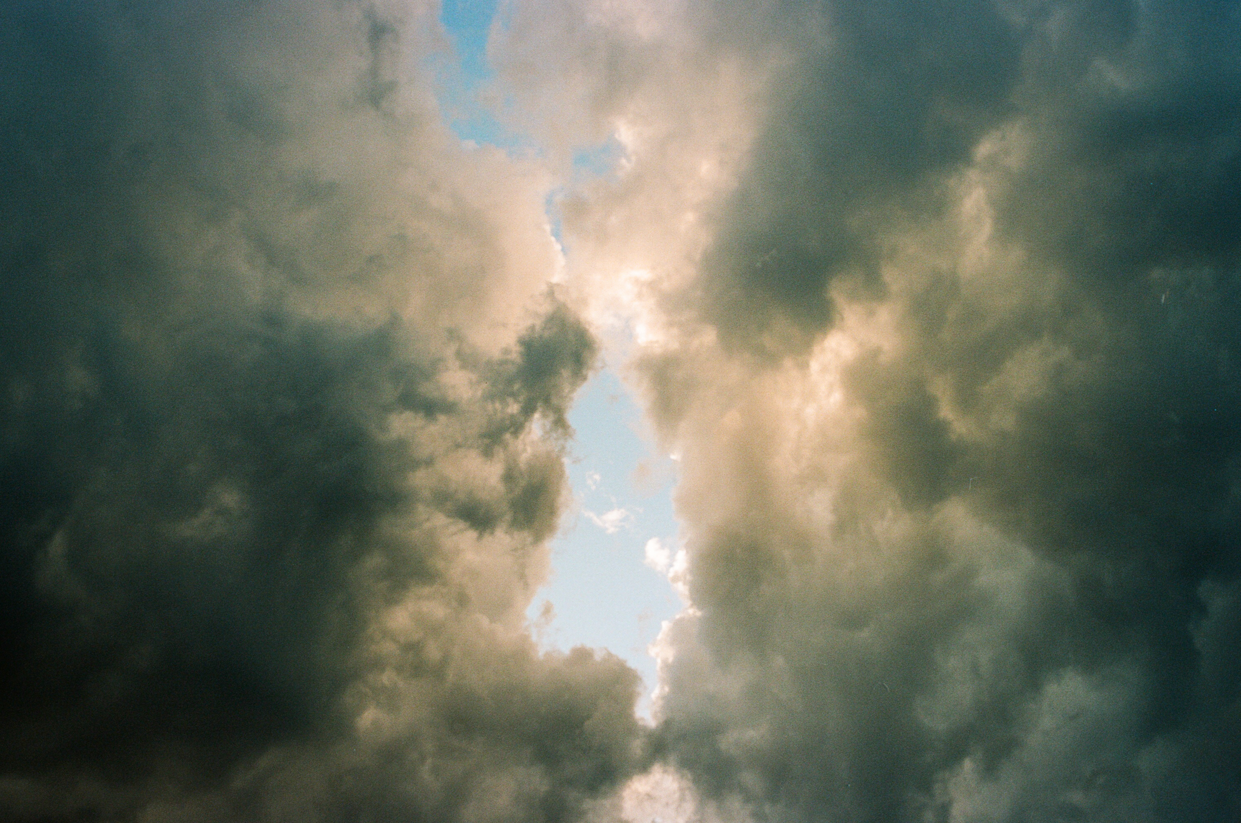
For now I'm using a Canon Rebel 2000 paired with Canon's 40mm f/2.8 pancake lens. It shoots 35mm film and can usually be found on eBay for under $20. The results are comparable to what you might get with a Canon Canonet 28 rangefinder which also has a 40mm lens. But unlike the Canonet 28, the Canon Rebel 2000 has autofocus, a motor to advance the film, and an endless array of lens options with it's EF mount. The pancake lens keeps everything small and lightweight, letting you leave behind the padded bag. It's simplicity allows you to see the camera for what it is: a box connecting film plane to lens. Above I've included a few images from this set-up shot on a roll of Kodak Portra 160. 

Even before getting my film back from processing, I already know I'll see images that accurately capture what I appreciated about a scene - something that doesn't often happen with digital. And all of this is done with a camera that I'm not sentimental or concerned about. It's stress free and I love the results. I guess that is what I was looking for. 

Film processed and scanned by Indie Film Labs

A Presidential Portrait, and the Language of (Bad) Lighting

Published on PetaPixel

Nine months after taking office, the White House has finally released official portraits of both President Donald Trump and Vice President Mike Pence. Last month the Washington Post did a story highlighting the empty walls of some 9,600 federal buildings - all waiting for for an official portrait of the new POTUS. In the meantime, the Department of Veteran Affairs was instructed to download/print a much older portrait of then candidate Trump, seen below.

As a photographer and veteran involved in policy work, I am interested in both the messaging and methodology of Trump's two official portraits. As a baseline I will compare Trump's two portraits against a more standard portrait seen with Vice President Pence's and Congresswoman Murphy's portrait.  

Previously distributed official portrait vs the now current official portrait of President Trump.

Previously distributed official portrait vs the now current official portrait of President Trump.

Let us look at our baseline, the standard portrait. Below are two images, one of Vice President Pence and the newly elected member from my district, Congresswoman Murphy. As a whole both are consistent in the obvious ways that matter, so lets go in. Both have multiple catchlights that bring attention to the eyes, giving them a three dimensional quality. A soft key light is positioned camera left, with a bounce for the fill on camera right. Both appear to have a contrast ratio of 3:1 between the key/fill. Skin tones are excellent on both, white shirts are a true white, though the saturation of the most dominant color (red ) seems much more saturated with Mike Pence compared to the Congresswoman (pictured right.) 

Vice President Mike Pence and Congresswoman Stephanie Murphy

Vice President Mike Pence and Congresswoman Stephanie Murphy

Similar catchlights for both, though the Congresswoman has one additional source.

Similar catchlights for both, though the Congresswoman has one additional source.

Now, lets look at President Trump's two official portraits - the similarities between them and then compare against more standard portraits with the examples above. 

3.jpg

Notice the catchlight in both images: a single, specular source placed below the subject's eye line. Normally this is placed at a 10 or 2 o'clock position. Here they are 8 and 4 o'clock - the exact opposite of Pence and Murphy. This placement of a main light source as used in filmmaking usually suggests something rather negative about the subject: that they are sinister, to be feared, or not to be trusted. In Trump's previous portrait it is much easier to see the effect of this low angle source - look at the hard shadows created by the subject's nose on the camera right side of the face.

Donald_Trump_official_portraitt_edit.jpg
Official Portrait of President Donald Trump and Vice President Mike Pence

Official Portrait of President Donald Trump and Vice President Mike Pence

Looking at President Trump's portrait vs Vice President Pence's, there simply isn't enough light from a controlled source to render his shirt a true white (notice the warm reflected light of Trump's skin down onto his shirt.) Compare the luminance of Trump's skin/teeth/hair against that of Mike Pence, there is no comparison. With a portrait, the skin needs a certain amount of light to absorb and then reflect that light back, giving it a sort of glowing quality. In Trump's new portrait, there simply isn't enough light hitting the subject.

In the West we read not only words from left to right, but also movement, contrast, and story. A character walks across the screen from left to right: he is going forward. A character walks from right to left: he is going backward. The direction of movement tells us something often subconsciously. Light hitting the subject from camera left and wrapping around a subject's face creates visual interest, contrast, AND is in keeping with how we would normally read: from left to right. In Trump's new official portrait that story, movement, and contrast as told through the use of light just simply isn't there. It looks as though most of the light is coming from existing overhead fixtures in the room.  

I would agree that Trump's new portrait is an improvement upon the one previously distributed. But as a photographer and someone involved with policy work, my take is that President Trump's newly released official portrait is terrible (especially when viewed next to Pence's.) And most curious about both of Trump's portraits is this intentional, hard light source placed below the subject (sinister lighting technique.) This just strikes me as odd. I cannot help but wonder if Trump himself is insisting that he be photographed this way? 

You be the judge. 

Lighting Journal

I wanted the whole Washington Post (scene) to have a pale light simply because the workers were overworked. They smoke, they drink coffee, and probably drink a lot of booze. Their lifestyle was very consuming. The skin was pasty and pale so the lighting had to reflect that.
— Janusz Kaminski, DP for Spielberg's "The Post"

One of the earliest challengers of film school was "seeing light," pretty quickly I realized how much work was ahead. Lighting I. Lighting II. Advanced Lighting. No wonder we had so many classes on the subject. I knew the films I liked but in watching a movie I couldn't identify each light source or describe it’s qualities, much less the impact on the audience. One of our assignments was to observe things like direction, color, quality, and intensity. We were instructed to gather stills from feature films and then describe characteristics of each light source along with mood and tone. (Above I've added some of my slides from that assignment.)

Consider how much information the lighting gives it's audience: where to look, who is important, are they good or bad, what time of day/year is it, what is the genre, is this set in the past/future, is this person trustworthy? And then consider how lighting does all of this. Do hard shadows from a light source placed below a subject's eye line make them appear sinister? Does a twinkle in a character's eye make them seem more trustworthy? Does warm light make us happy or sad? 

Gathering stills and creating a lighting journal are essential homework for any aspiring cinematographer and can only help most photographers. The goal is to create a reference point by observing what professionals are doing in their films. The result is you learn to become more critical of your own work and hopefully more capable of producing images with the desired mood and tone.  


Drawing Lighting Inspiration from Spielberg’s ‘Lincoln’

Published on PetaPixel

Left: Lincoln - Janusz Kaminski, ASC                              Right: test shot with light/fog 

Nick approached me as he was finishing his degree, wanting his portrait taken to commemorate the event. With his references, wardrobe, and location, I saw an opportunity to replicate some of the lighting I had seen in Spielberg's Lincoln. As a period film set in the mid 1800's, light sources were limited to daylight, moonlight, or some variation of flame, ie. oil lamps and candles. My hope was to capture the magic of Kaminski's lighting, while also adapting it to not have my subject completely silhouetted. 

On location I usually start by creating a baseline - adjusting my settings to capturing an image that looks similar what is seen with the eye. Our starting point is a mid summer evening in Orlando, which means the sunset is a vibrant orange, with plenty of reflected green light from the exterior foliage. This quality of light isn't necessarily bad, it's just not what I wanted.

So I placed a strobe outside pointed through the window with curtains as the only diffusion and voilla, a light we can finally work with. So we have our main light but we're not finished, we need to give that backlight all the glory it deserves. More often than not, hazers are used in films to provide some atmosphere or texture for the light to 'grab.' At times it's justified in the scene with a character smoking, a hot shower, a fireplace, etc. Yet even when it's not justified, we(the audience) do not question it. Actual hazers are pretty expensive, so I find myself using a cheap amazon fogger and fan to break it up. The key word here is subtlety, give the fog time to settle and then break it up with a fan. For the final image we let the fog settle, brought Nick a chair, put on a 28mm lens and used a silver bounce for his key light, with strobe pointed through the window as a backlight. 

Taking inspiration from period films gives you a great opportunity to create a cinematic look with minimal equipment. Sometimes you want to create something stylized like this daylight/moonlight, or maybe you want it to be a different time of year? With a bit of study and the right equipment, it's easy to change up your portraits and light like the movies. So get out there and create the light you want.   

Final image with added key light

Final image with added key light

9/11 Memorial

If we learn nothing else from this tragedy, we learn that life is short and there is no time for hate.
— Sandy Dahl, wife of pilot of Flight 93 Jason Dahl


All images captured with a Fuji 6x9 on Ilford HP5. Scanned on an Epson v500

Shooting at 13,500ft

Published on PetaPixel

“What single moment defines a skydiver?” This is the question I kept asking myself as I prepared to photograph Sarah. At the time of this shoot, I only had a few tandem jumps(attached to an instructor.) For me that "moment" had always been getting in the door before a jump. You can put the gear on, you can ride the plane up, but getting to the door is where you really have to face yourself. And so it was this moment that I chose for our shoot: at the door, arms overhead, eyes fixed on the horizon.  

Knowing the tight space I'd be working in, I rehearsed the night before - imagining myself in the small plane I quickly dismissed the use of a soft box or umbrella. So I decided instead to bounce a flash off the metallic fuselage. In my office I set up a silver reflector and observed the quality of light bouncing across the room, as seen in the pictures above. This bounced /artificial light turned out to be just enough fill after properly exposing for the exterior.  

Drop zones turn a profit with a very simple concept: get a plane full of jumpers up and down as quickly as possible(so as to burn as little fuel as necessary.) So I would need to be certain of my plan in order to work quickly and be respectful of that. Composition, focal length, exposure, all of these decisions had to be made before we took off. So we rehearsed on the ground both with/without the flash. 

Considering I’d be untethered and near an open door I also had to wear a parachute. Sarah helped me wrangle all the straps while someone else pointed towards a handle saying “if you find yourself outside the plane just pull this, but you shouldn’t need to.” Ok. As we reach our designated of 13,500ft the pilot pulls the stick and pitches the nose of the plane slightly upwards, the plane slows - wings shuttering a bit, the door goes up and a green light comes on. A cold rush of air enters the plane and a thought of “oh shit,” crosses my mind. The plane full of jumper went out the door and now it was our turn. At ground level the temperature was a balmy 85deg, at 13,500ft that’s been cut in half. But it’s not the cold that has my attention, it's the realization that we’ve entered another dimension of sorts, where everyone readies themselves in their own way, and then with a “woosh” are quickly falling towards the earth. 

With everyone out, the plane is empty and our time has arrived. I ask our Tommy(the pilot) to position the sun at the tail, giving Sarah a backlight. With sun in place we moved in and fire the first shot without a flash, a few more with the flash, and then, with hair catching the wind, the moment I had hoped for perfectly arrives.  

And just like that I give Sarah a thumbs up, and told Tommy that we had the shot, he asks if we're sure and generously offers more time, “Nah I think we’re good!” I yelled over the noise. “Alright!” he replies in a “get ready” sort of way. The ensuing descent can only be described as an all out dive. As we hurtle back towards the earth I kept shooting until Sarah and I both thought it best we just brace ourselves. 

With feet firmly planted on the ground, I take a moment to admire the beautiful sunset Florida so often gives (while trying not to look like someone who almost threw up.) And though exhilarated from our shoot, I found myself longing more for the jump I had seen everyone else take. It may have actually been this photo shoot that helped me realize I could no longer just observe something so incredible. Today I have 27 jumps and thanks to Sarah and Jairo, now stand within arm’s reach of finally having my A-license! 

Follow Sarah & Jairo on IG for all their skydiving exploits, and come jump with us at Skydive Palatka